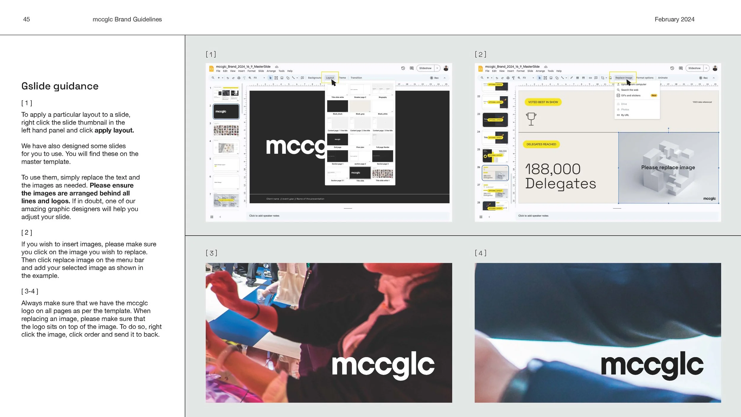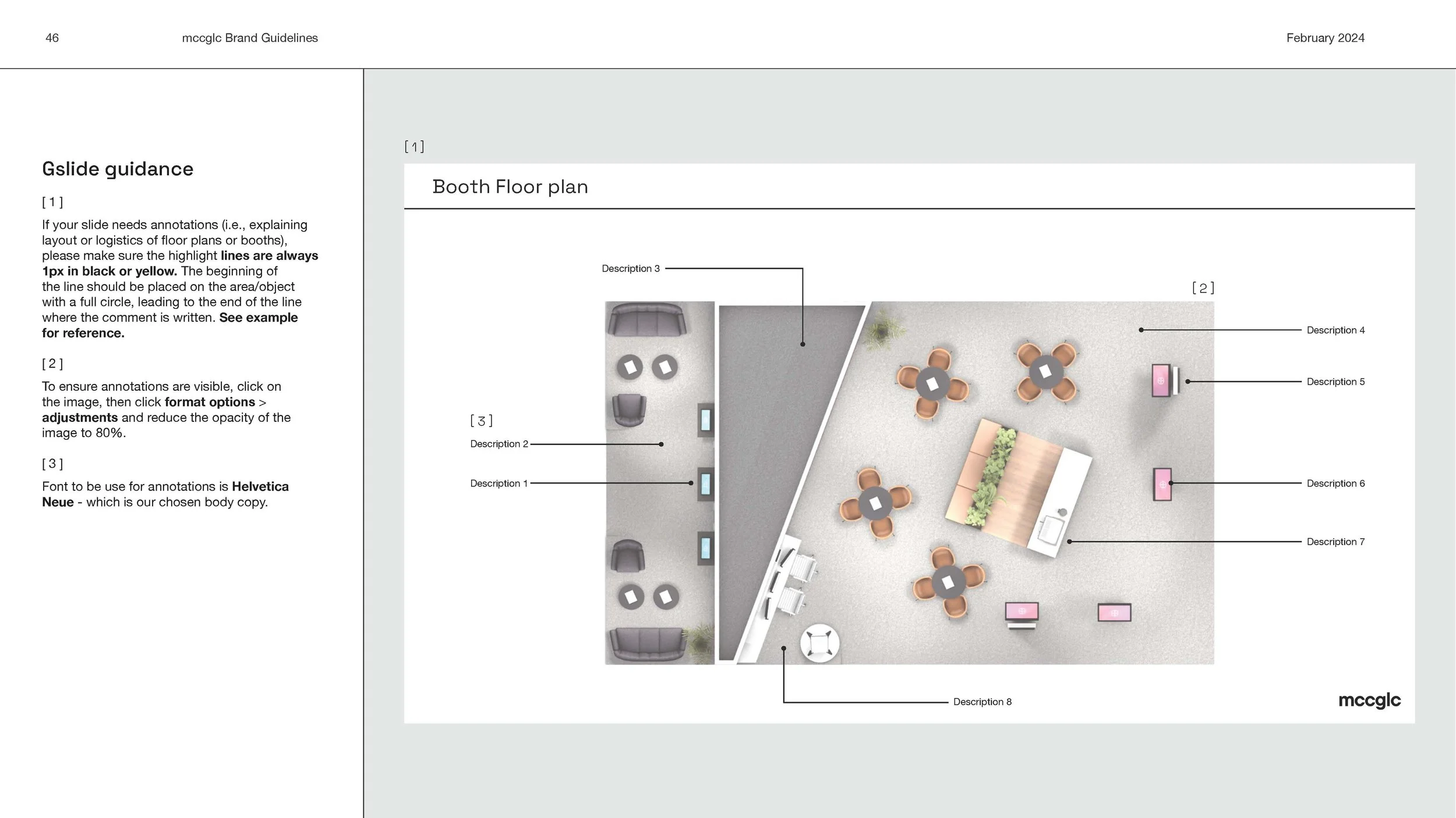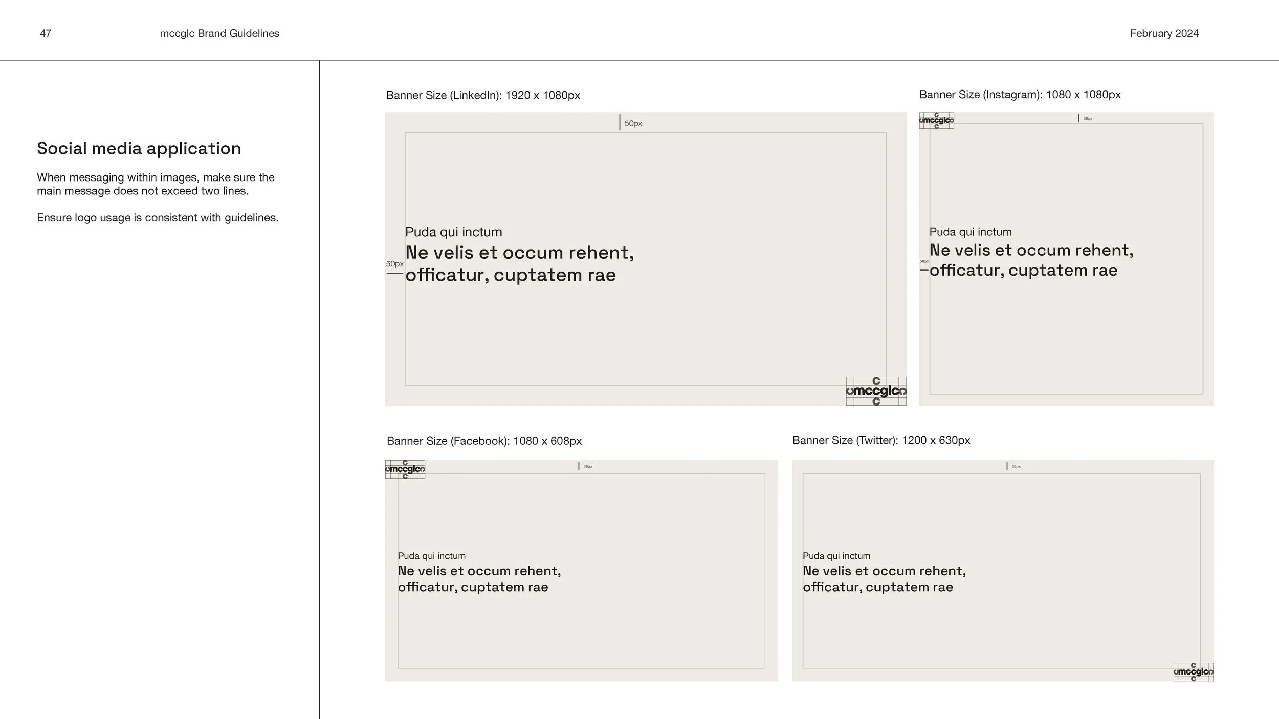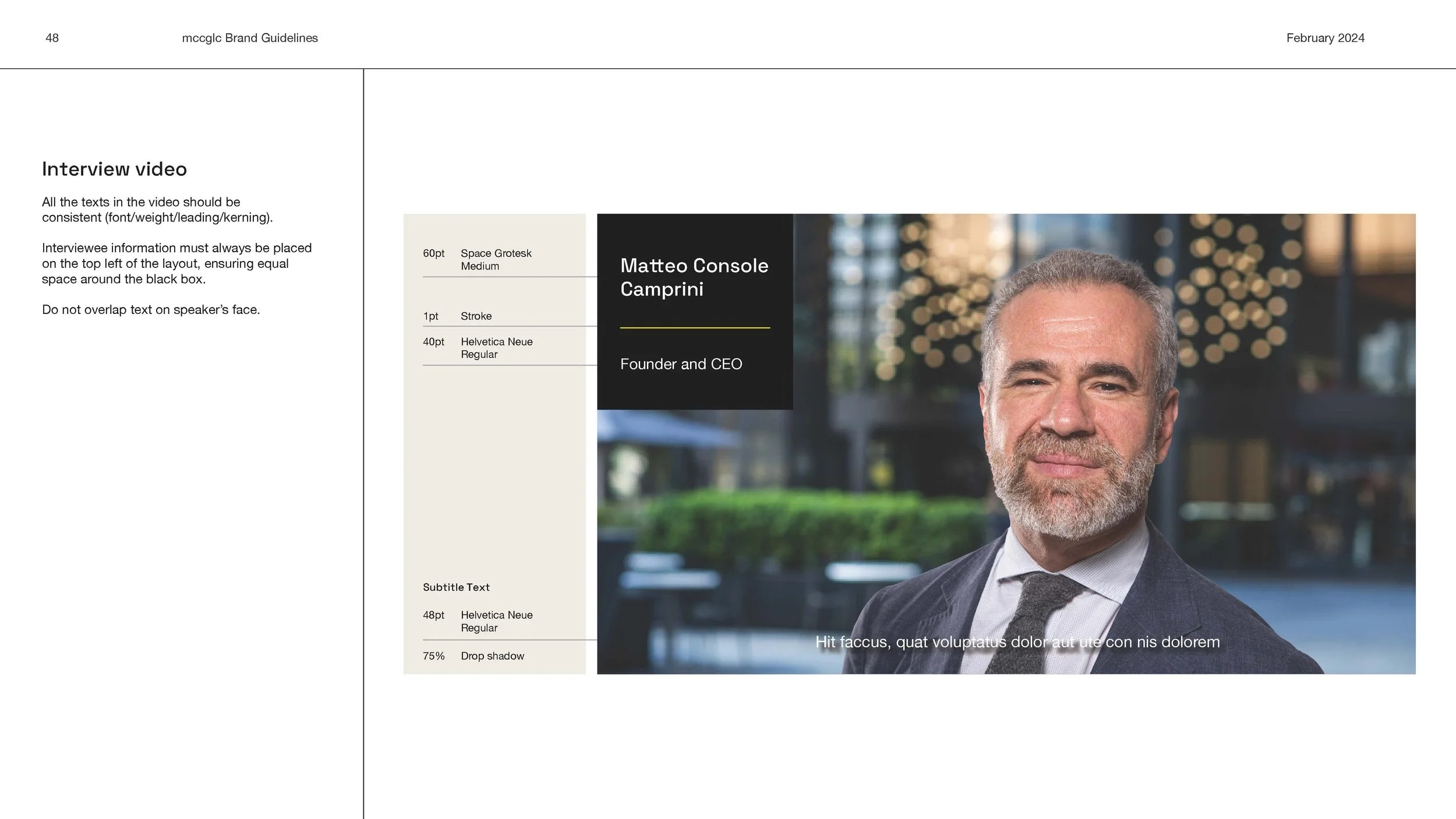
The rebranding of mccglc
and the visual identity
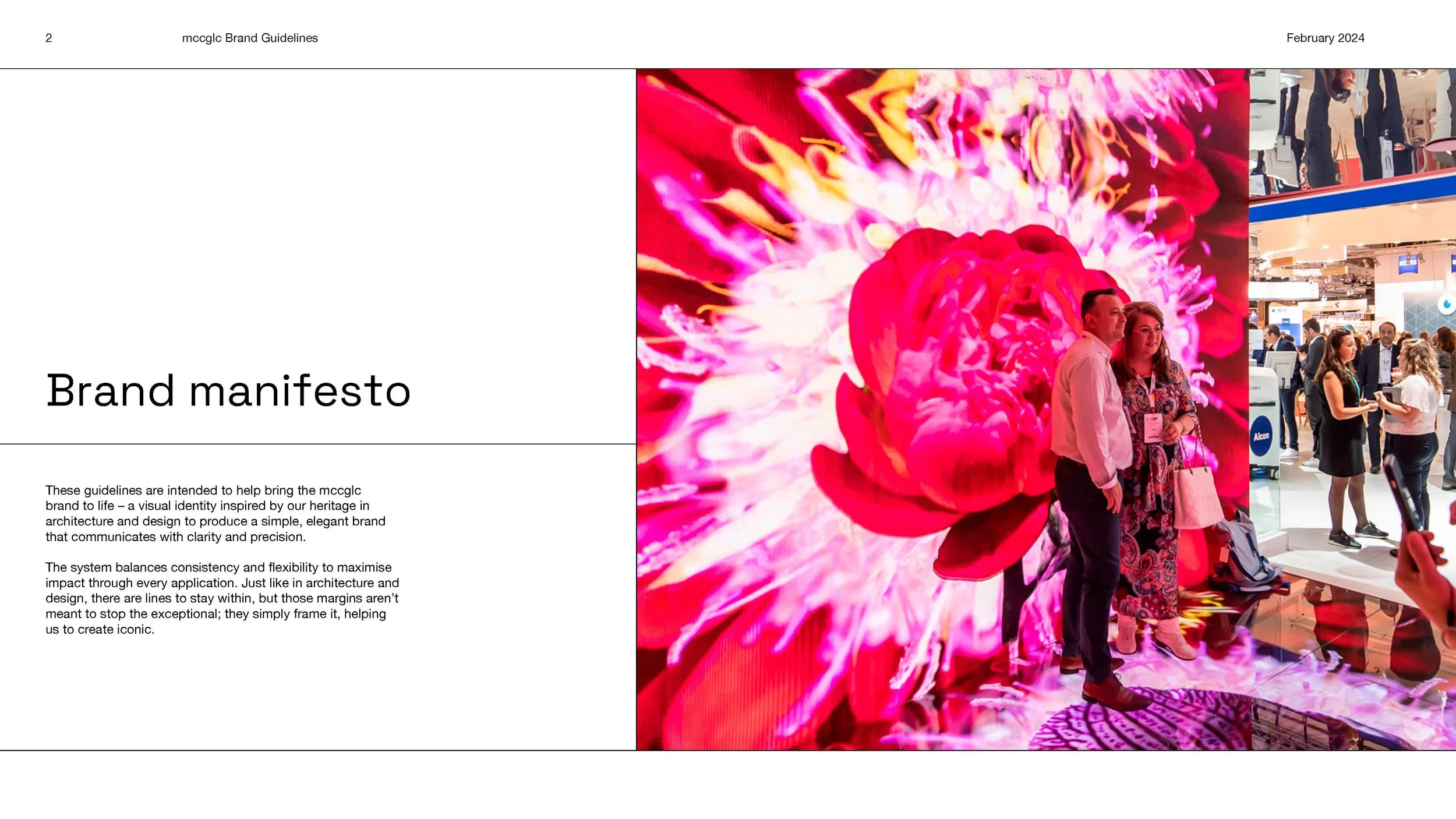
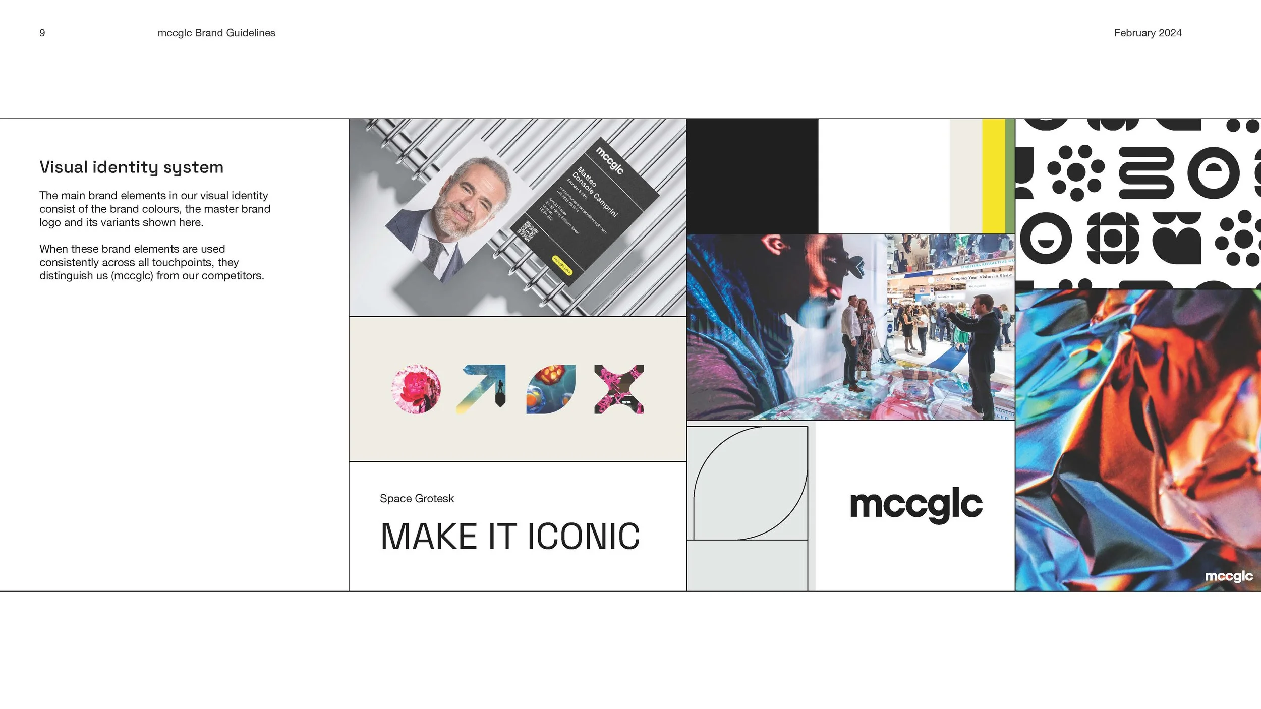
The mission was to rebrand mccclc and create a cohesive visual identity. Company values and a clear visual direction needed to be shown and have a fresh take representing the agency to our clients and consumers.
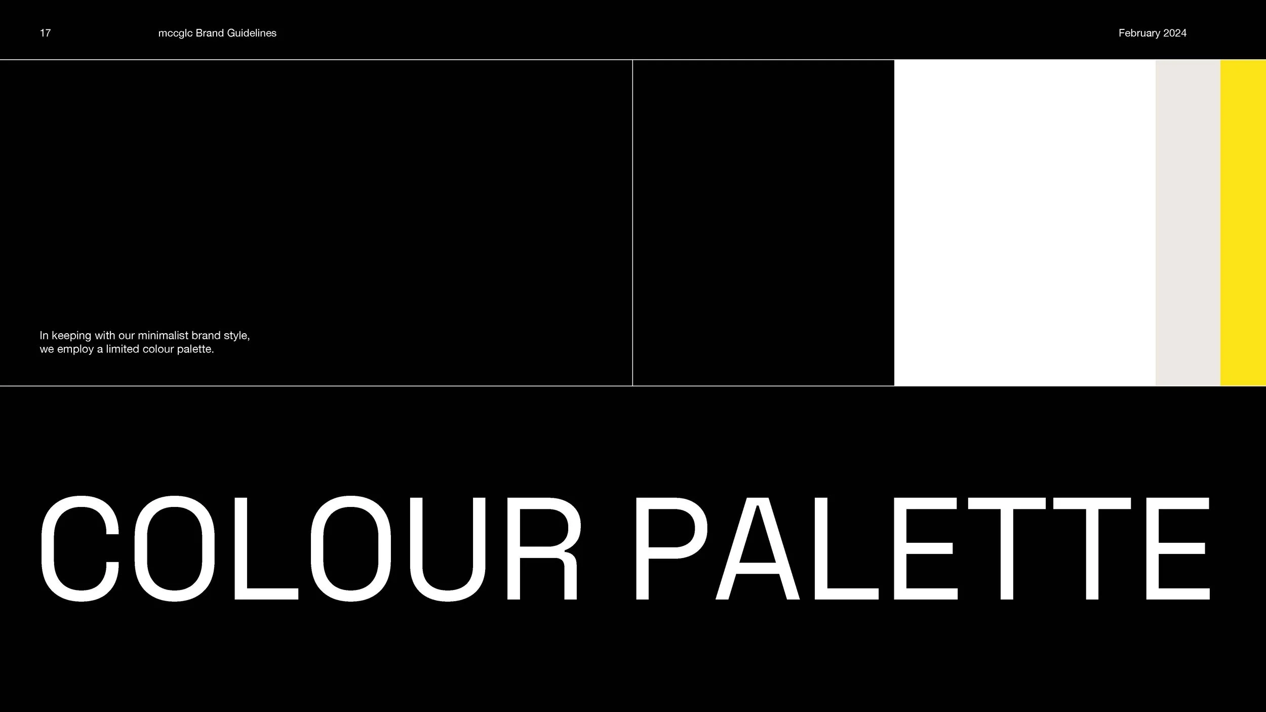
Colour Palette
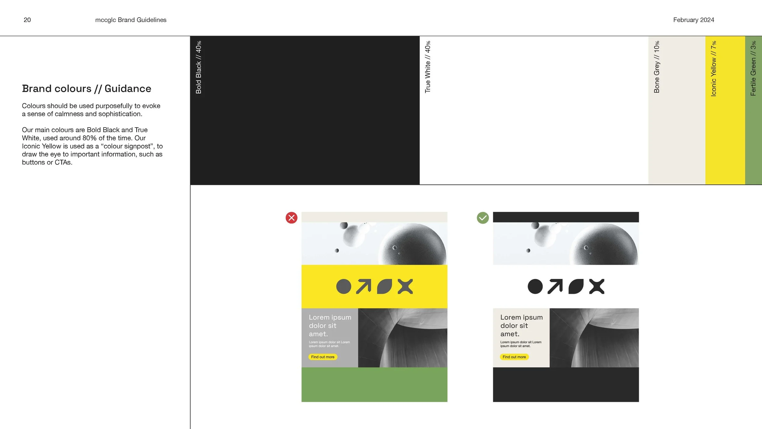
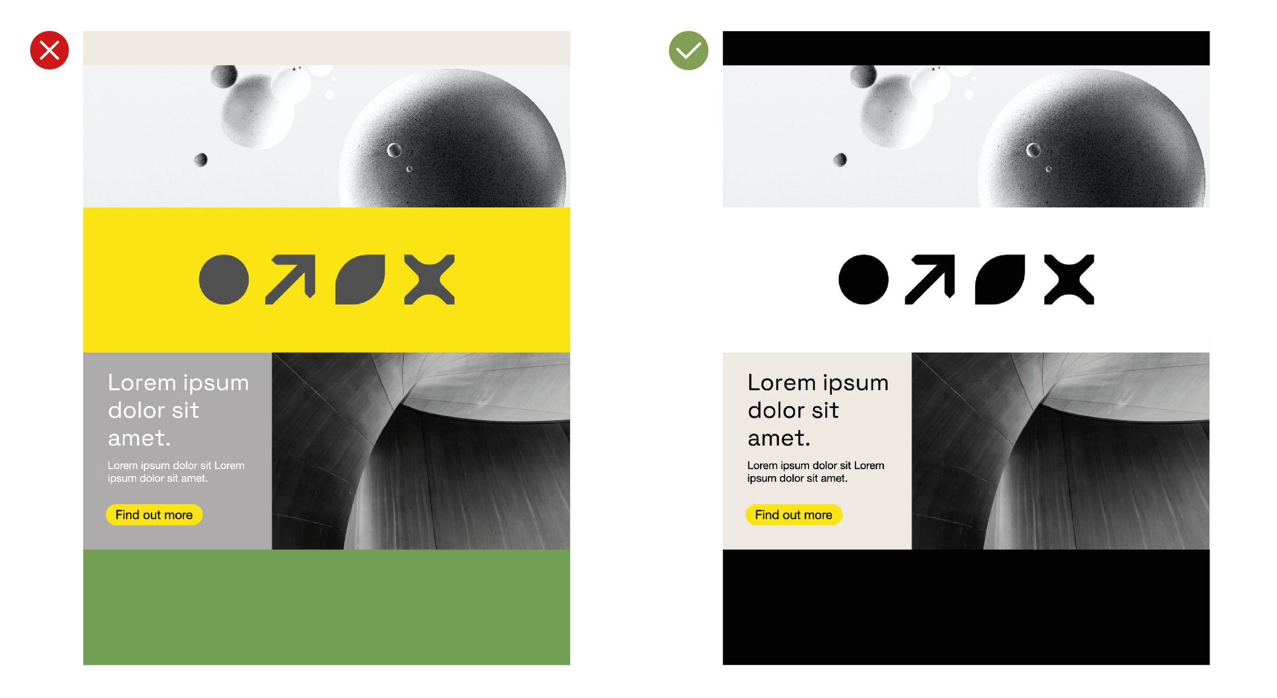
Colours should be used purposefully to evoke a sense of calmness and sophistication.
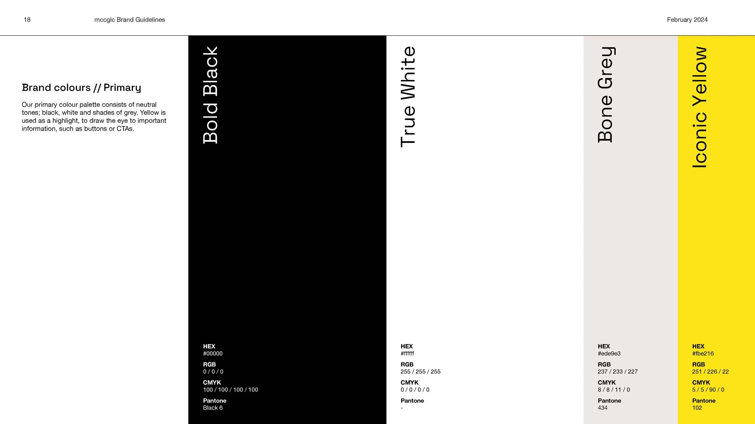
The main colours are Bold Black and True White, used around 80% of the time. The Iconic Yellow is used as a “colour signpost”, to draw the eye to important information, such as buttons or CTAs.

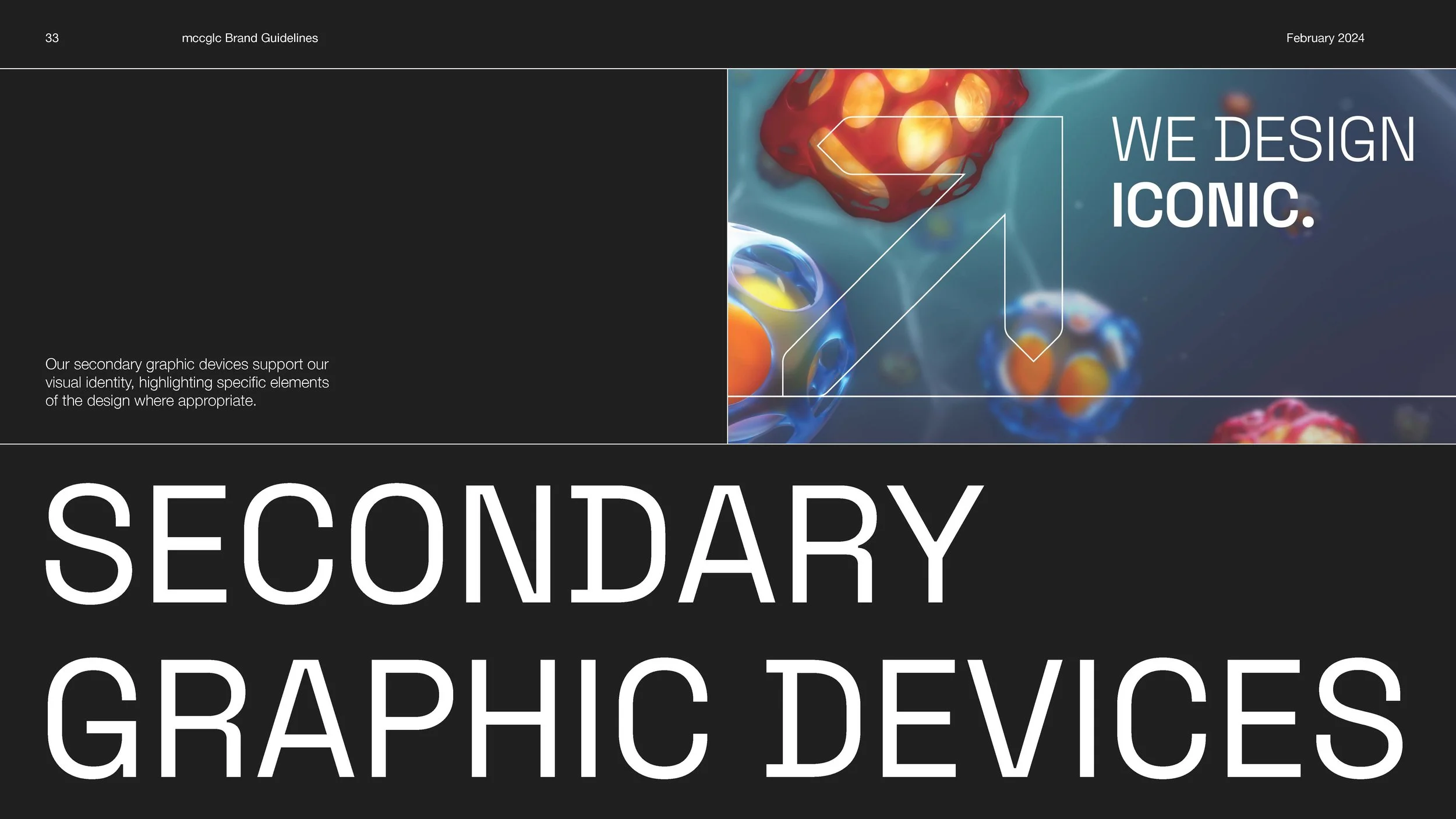
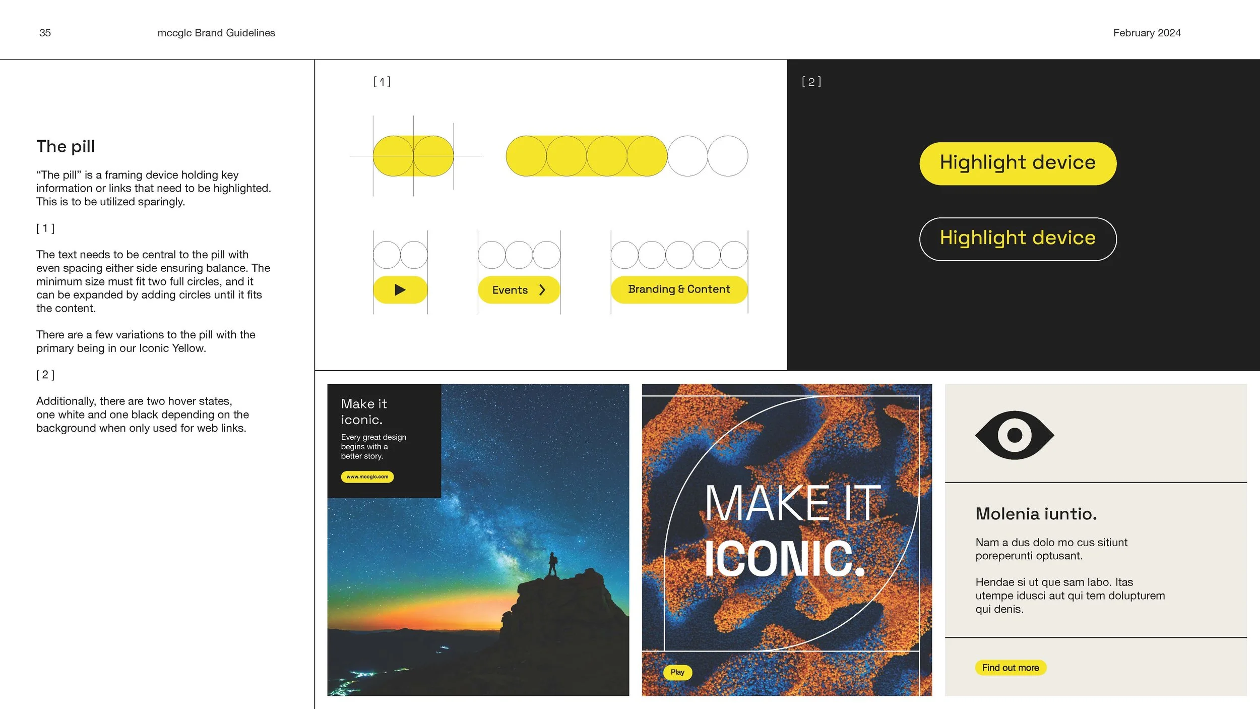
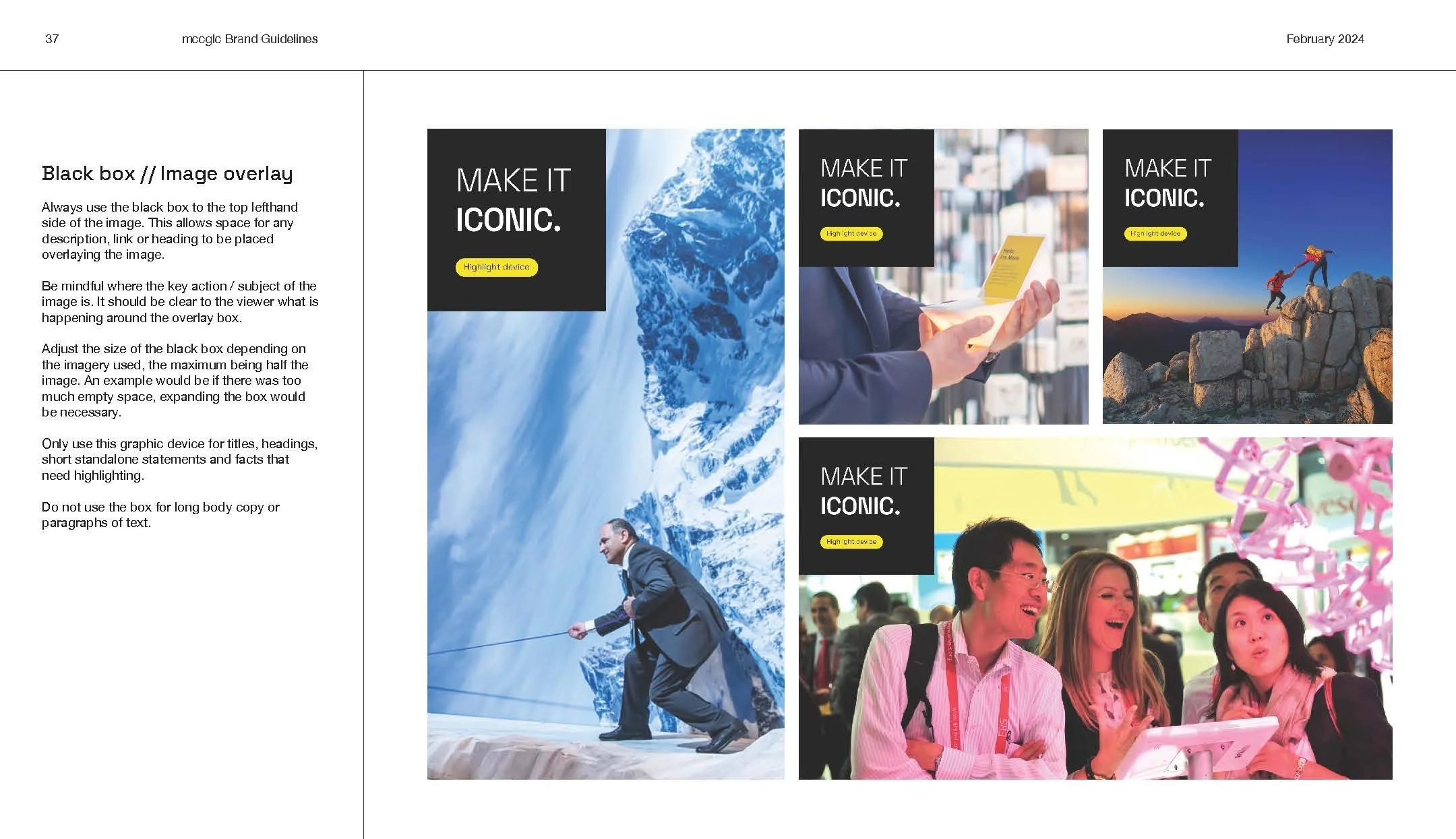
“The Pill”
“The pill” is a framing device holding key information or links that need to be highlighted.
This is to be utilized sparingly. There are a few variations to the pill with the primary being in the Iconic Yellow.


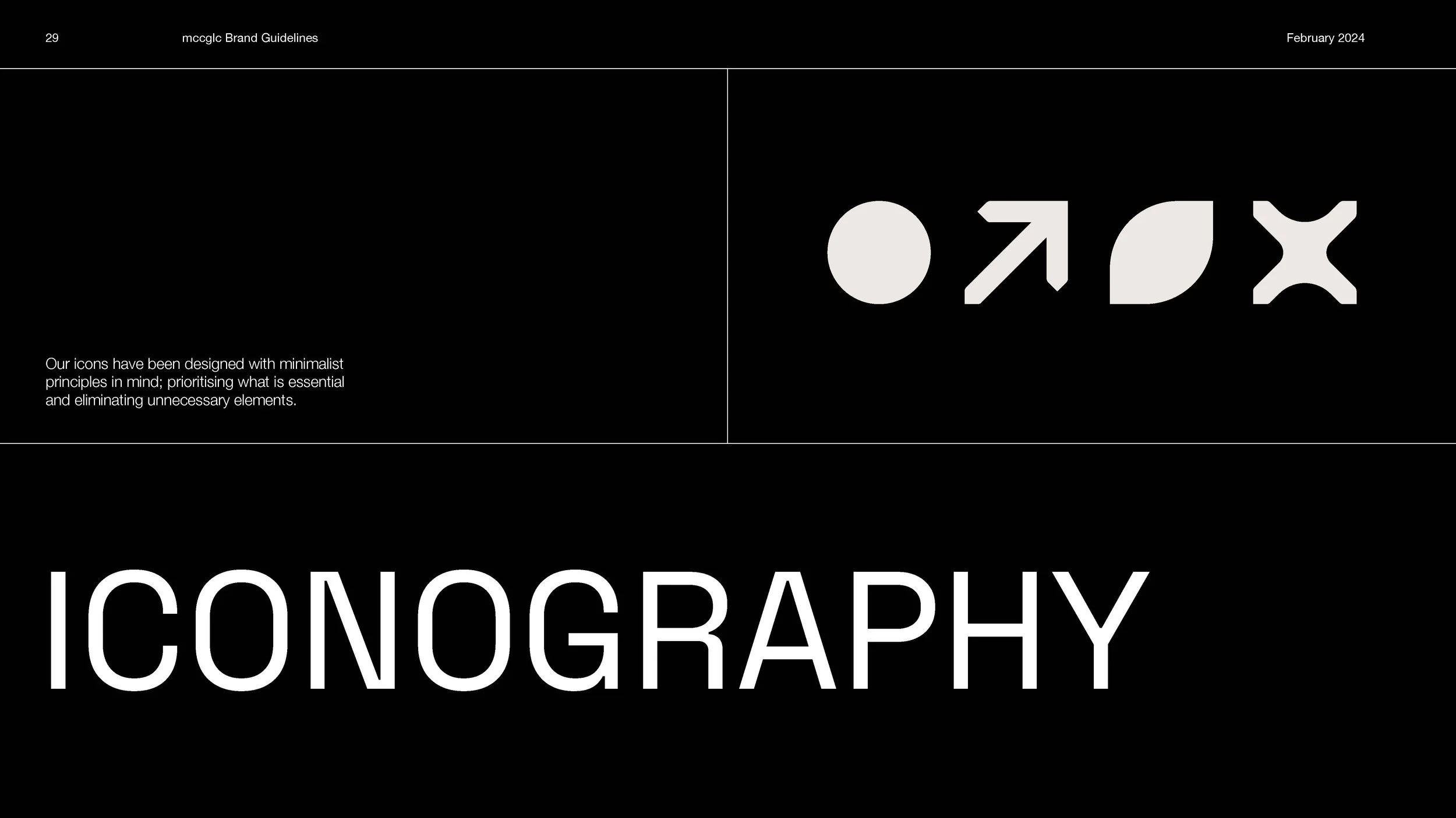
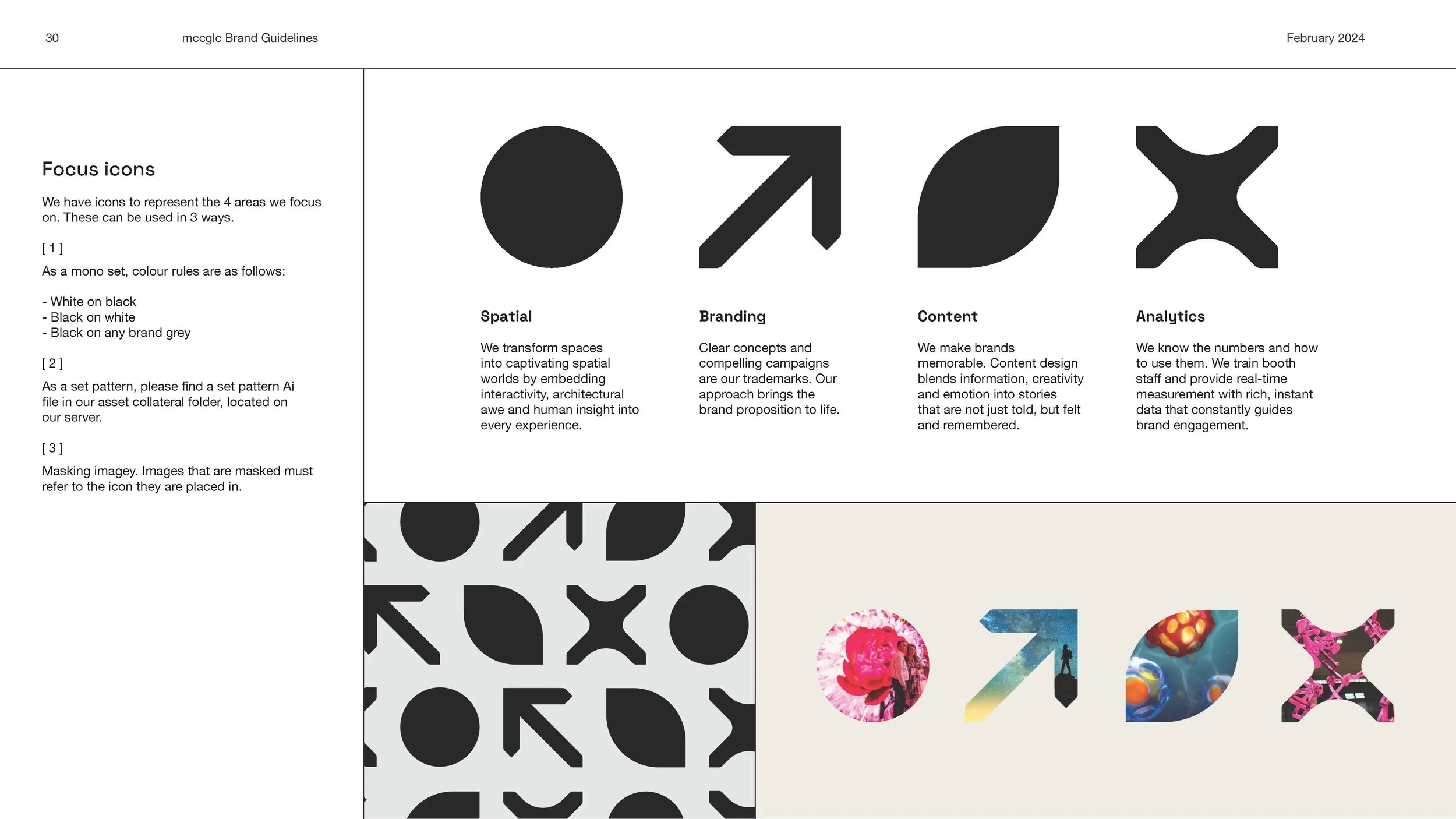
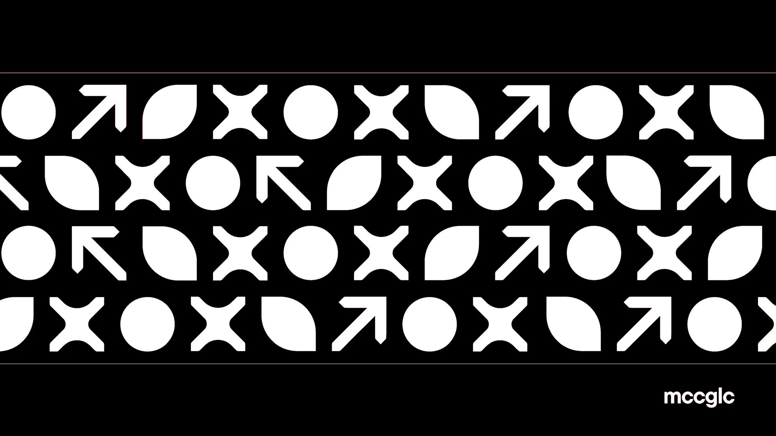
Focus Icons
We have icons to represent the 4 areas that mccglc focus on: Spatial, Branding, Content and Analytics. Giving a more visual way to show the offerings of the company made it more expressive and illustrative. These icons can also be used to mask imagery within each sector.


Spatial
Branding
Content
Analytics
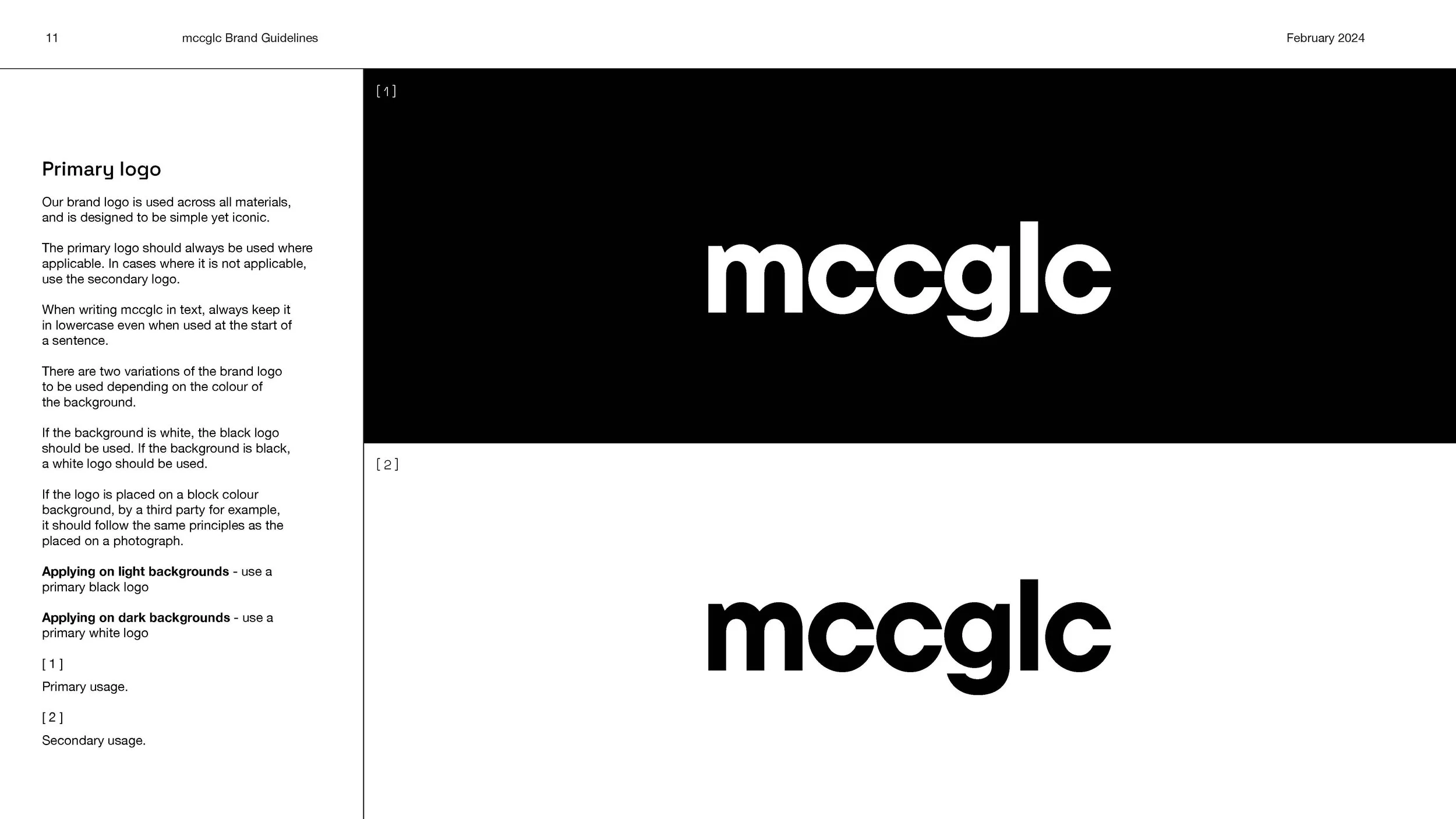
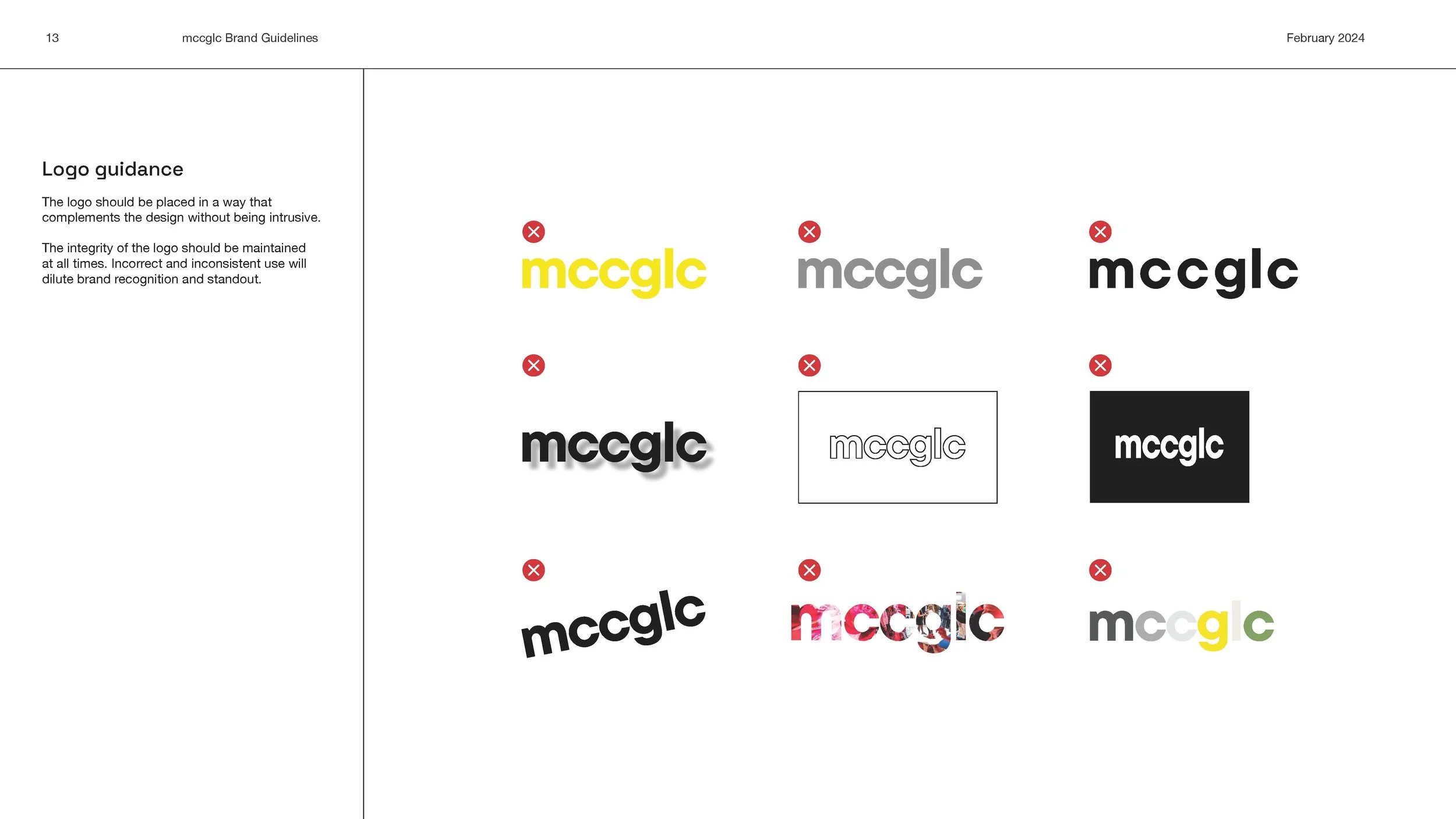
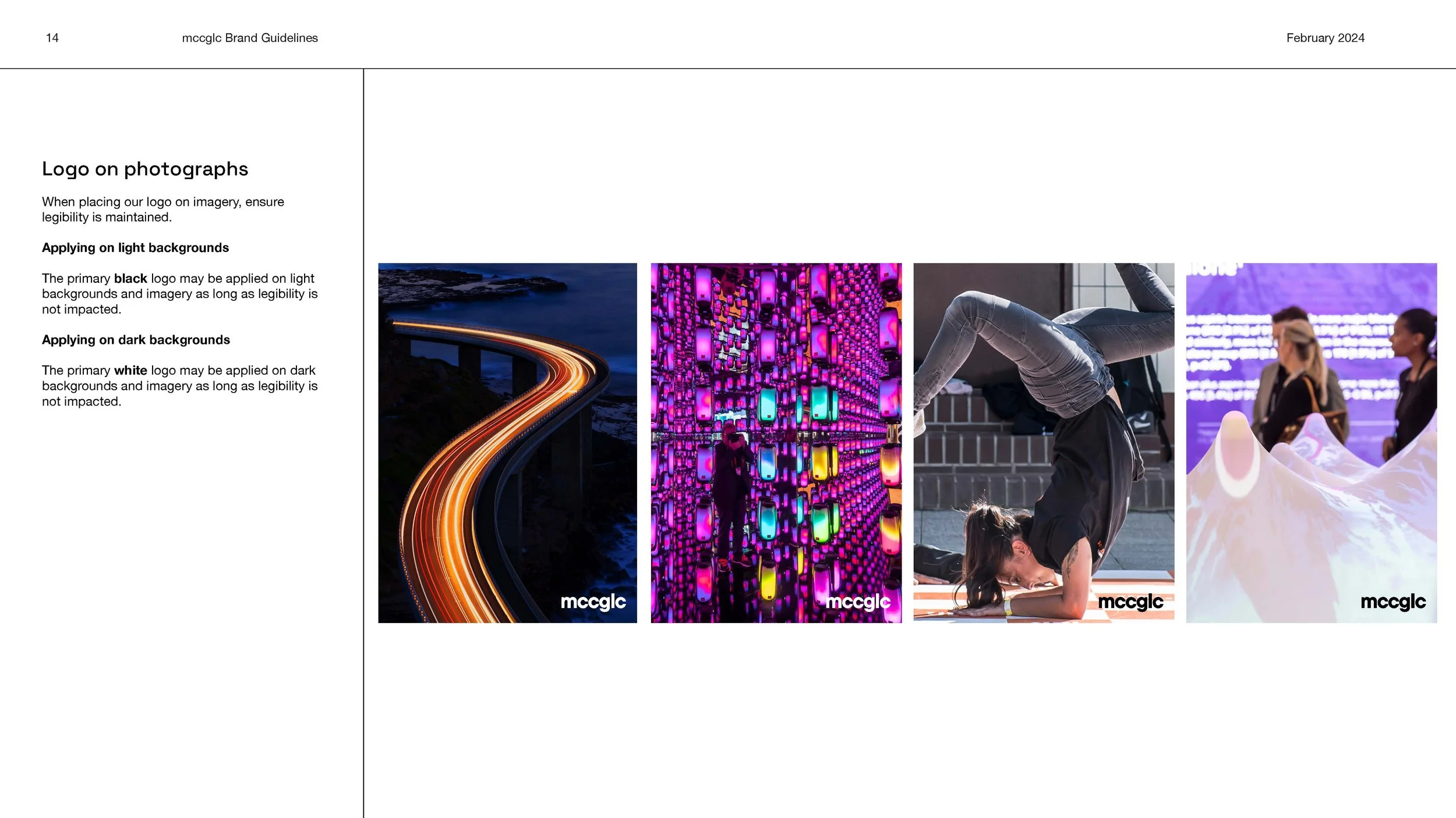
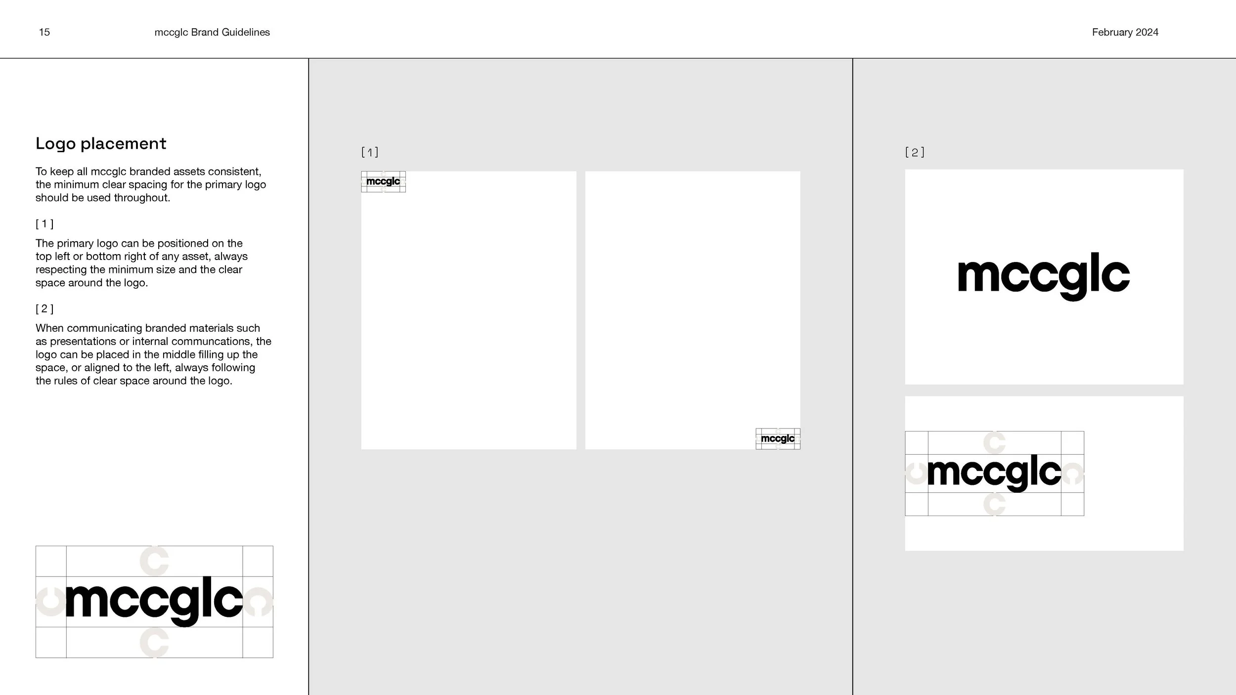
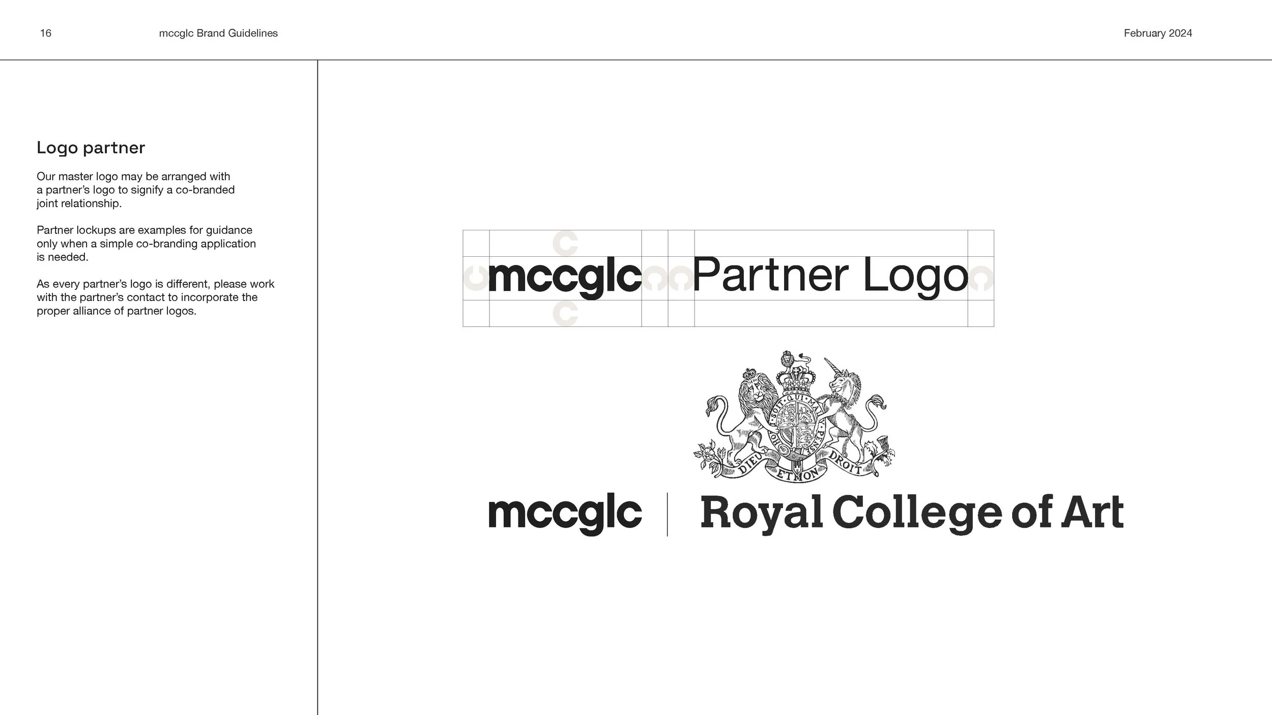
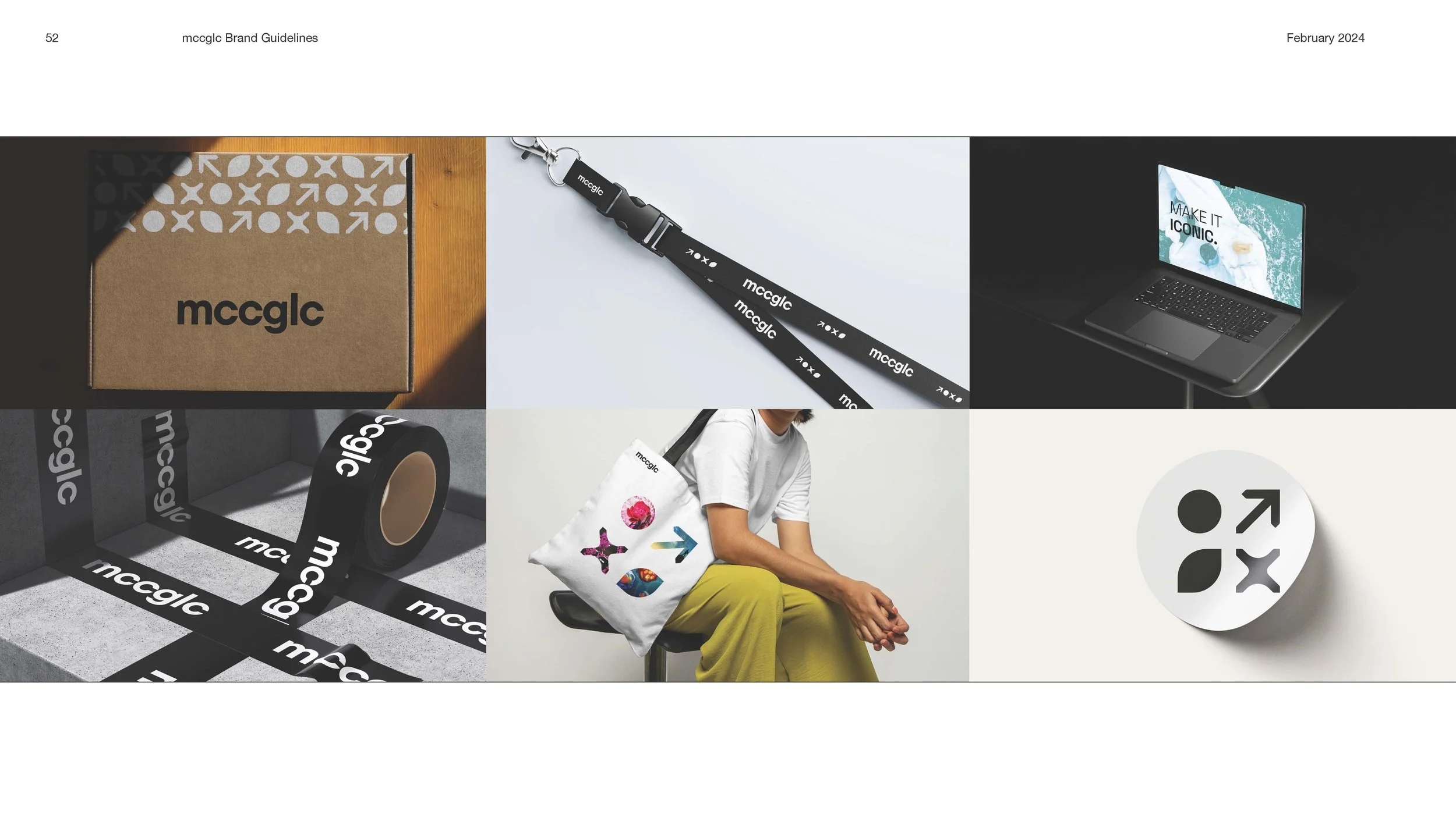
Logo
The new brand logo is used across all materials, and is designed to be simple yet iconic. When writing mccglc in text, always keep it in lowercase even when used at the start of a sentence. There are two variations of the brand logo to be used depending on the colour of the background. If the background is white, the black logo should be used. If the background is black, a white logo should be used.


Brand Guidelines
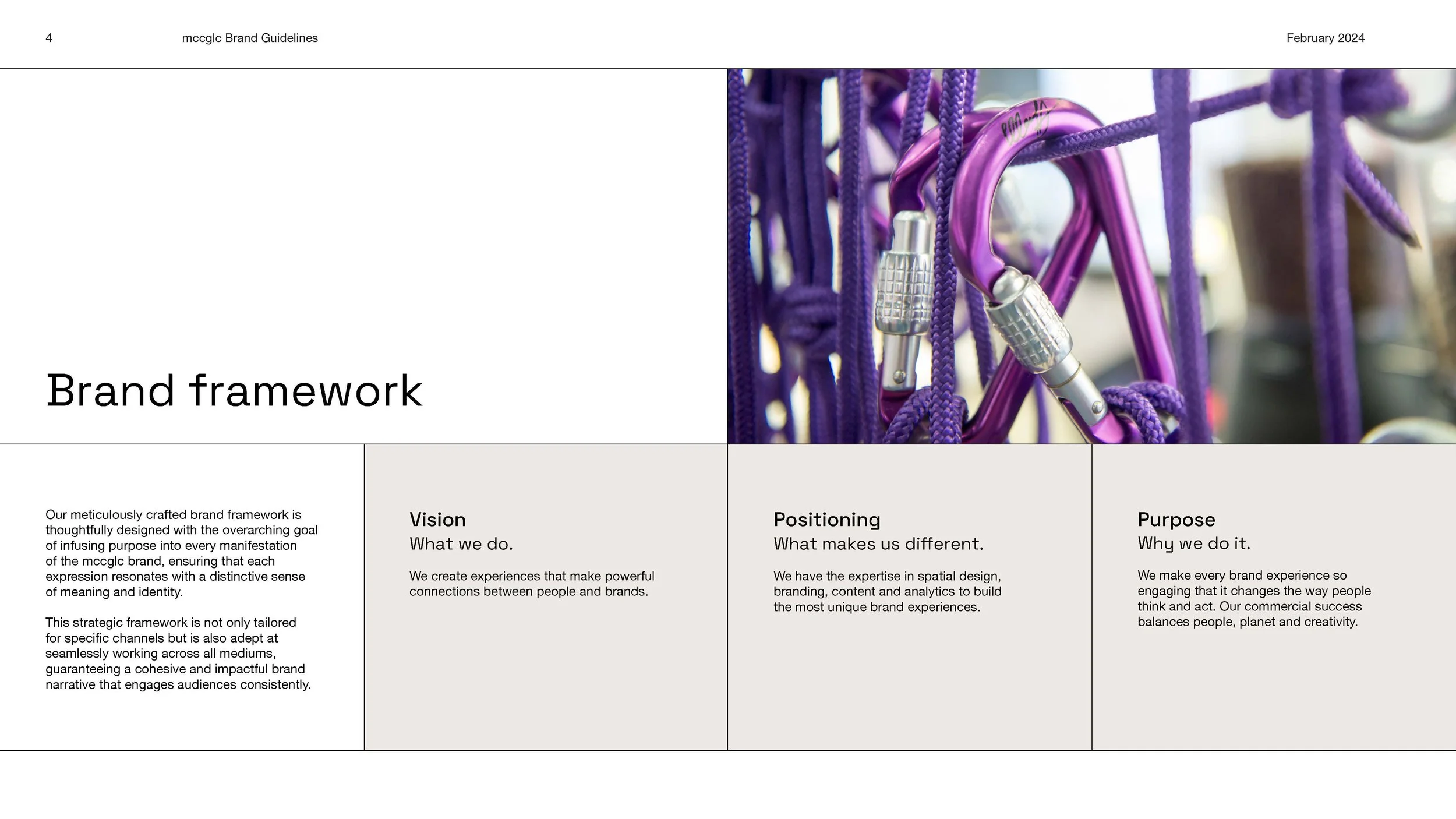
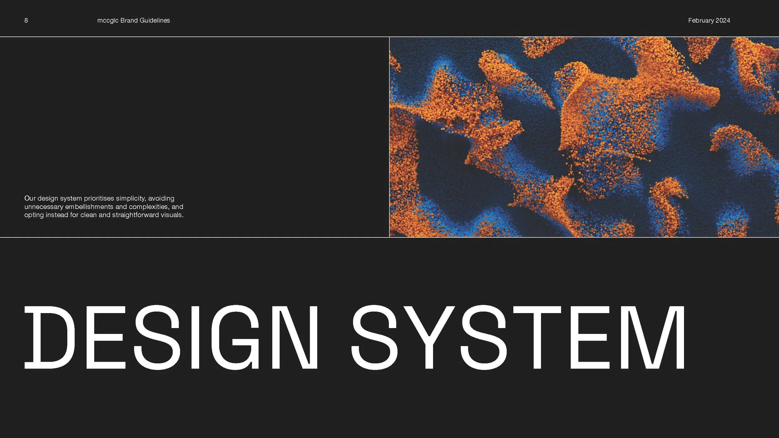
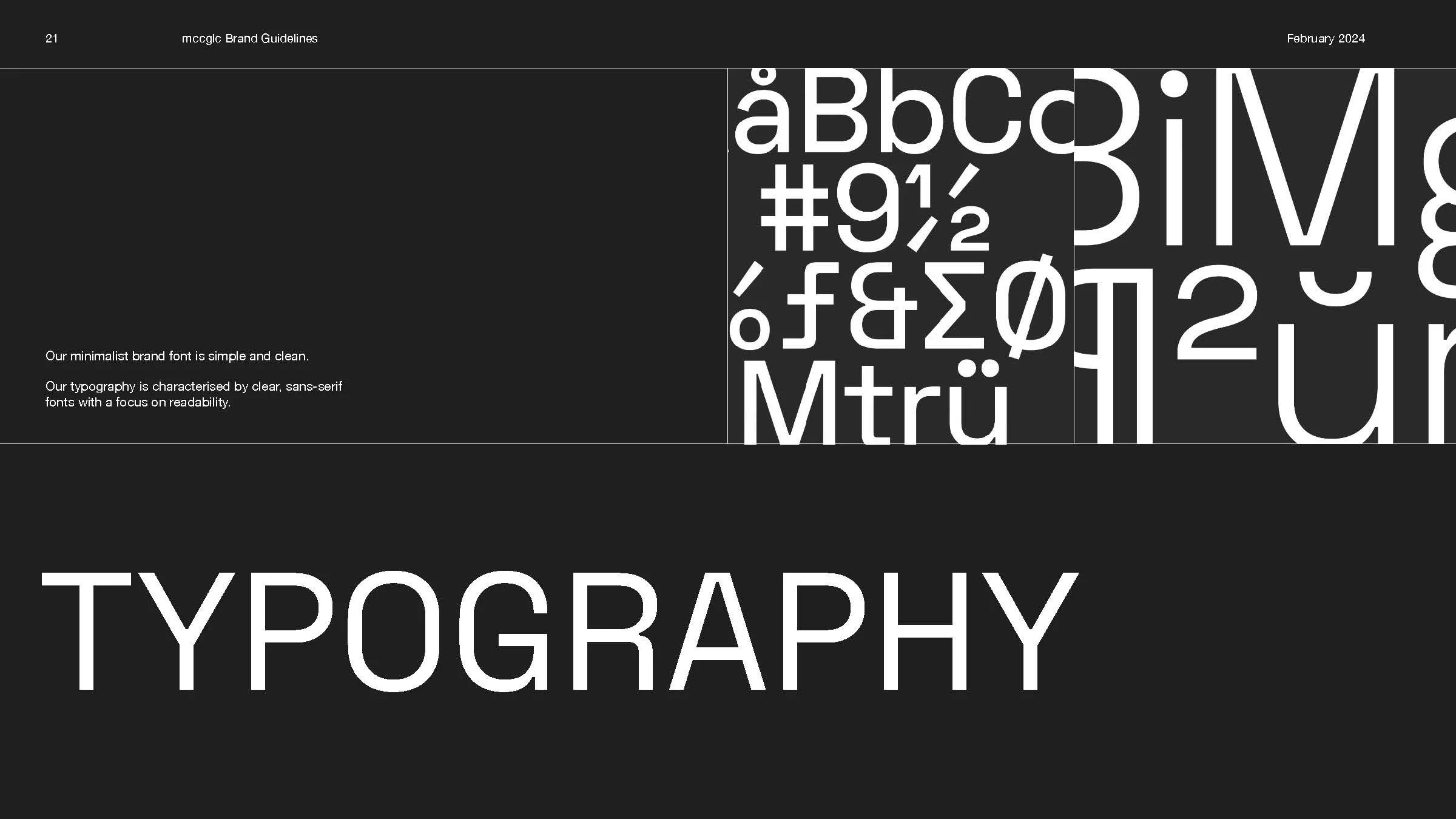
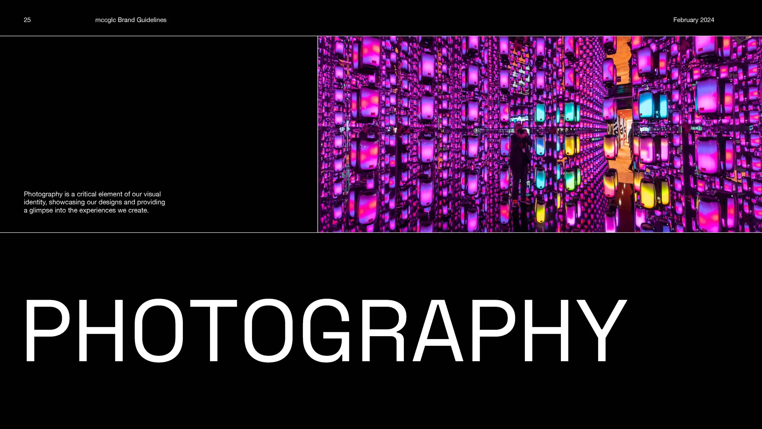
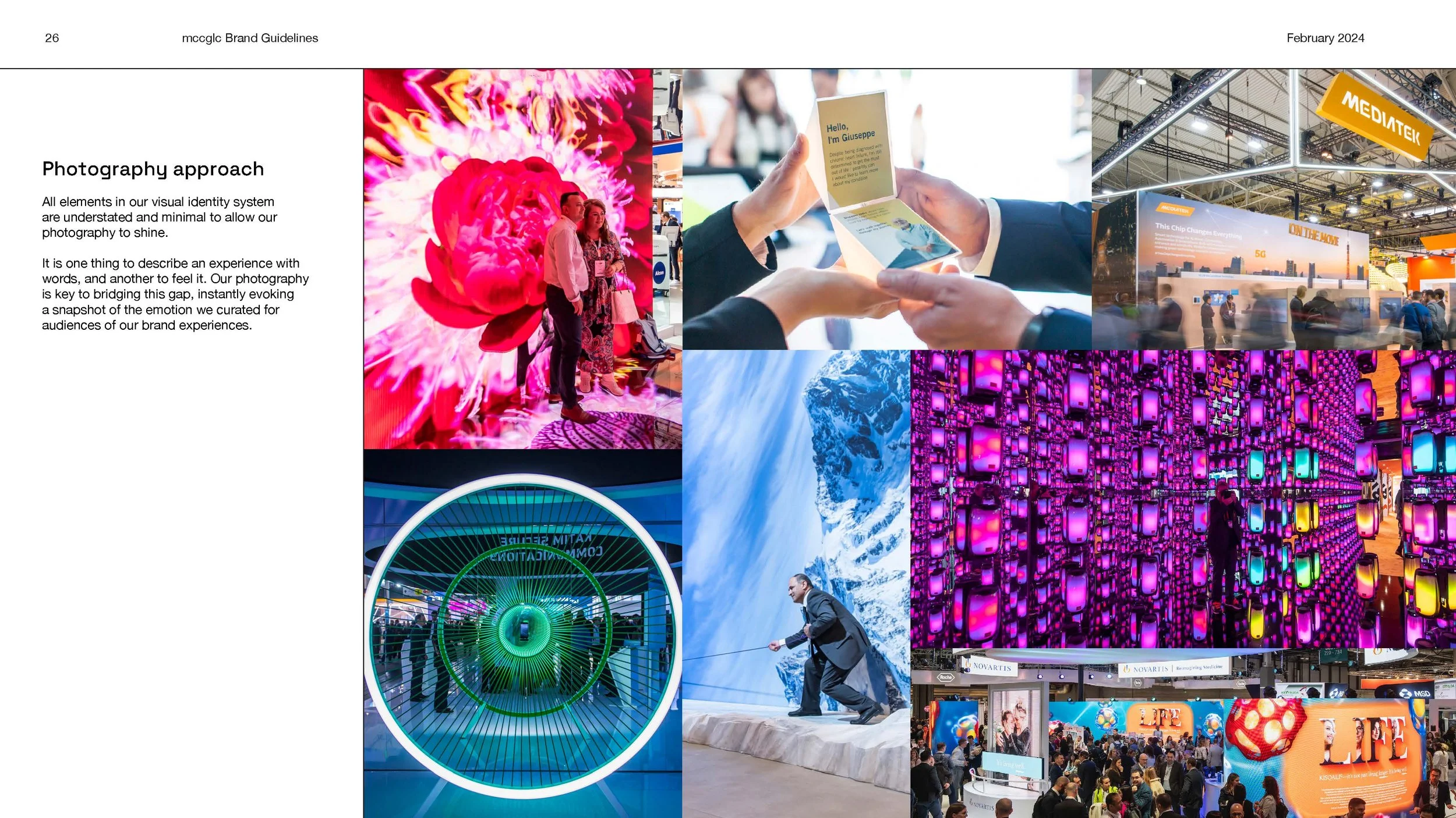
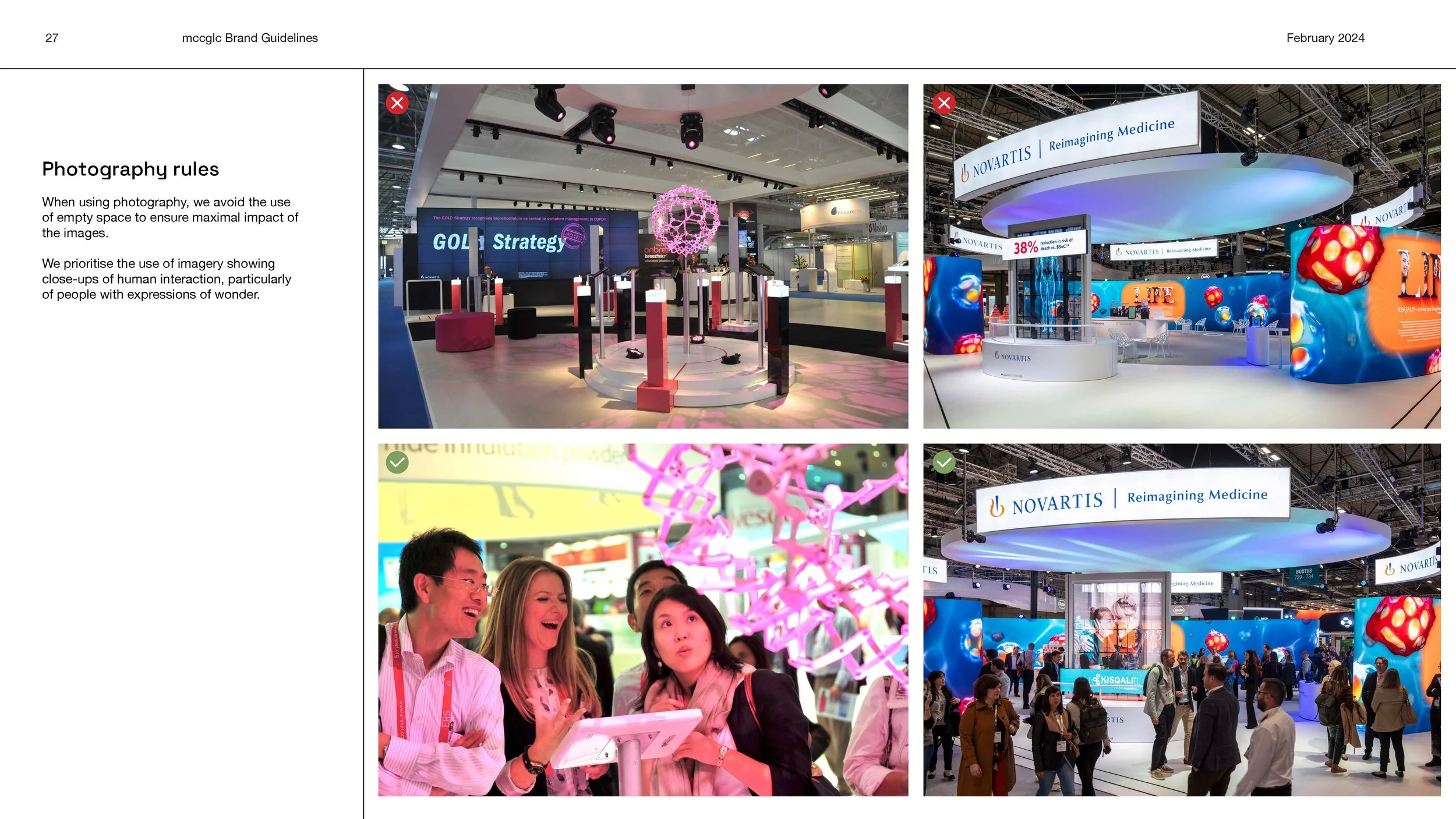
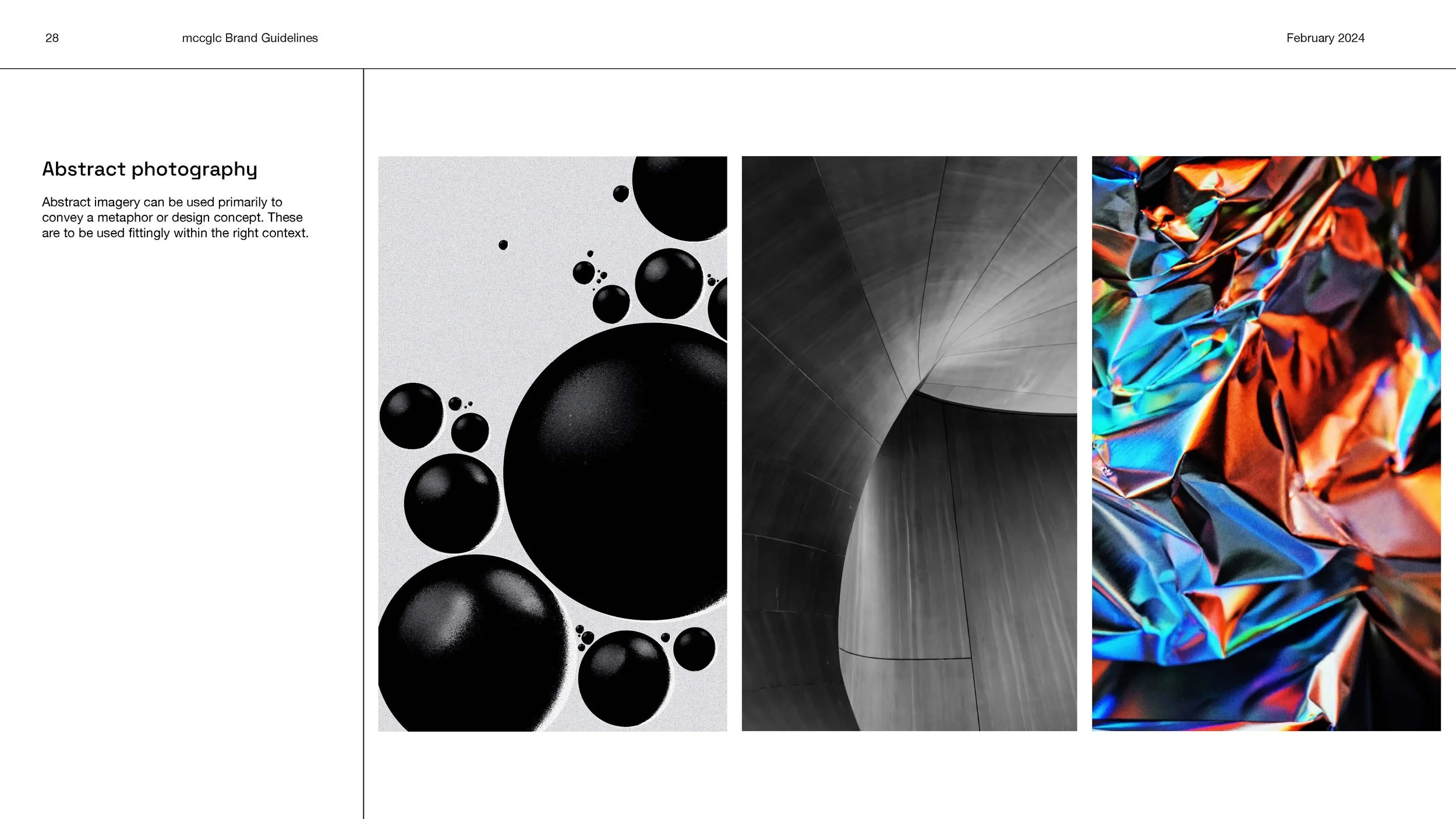
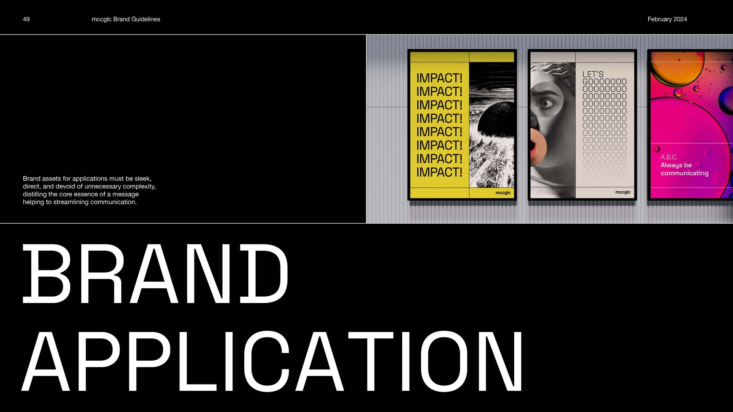
When designing the brand guidelines, it was important to be clear in design principles while still looking sleek. I wanted to show the minimalistic branding through the clean lines and structural elements, letting the imagery be the focus on each page.